In the previous Stats Page update blog post, I mentioned that the next version of the Stats Page will include changes to the panelist graphs to improve how they look and to make them more interactive.
Below is a current example of the two graphs that are currently generated for each of the panelists, one showing the breakdown of the panelist’s scores and the other showing the panelist’s scores over time. The charting library used to generate the graphs have some serious limitations, including poor font rendering and the graphs are static (a scheduled job generates the graph image files on a regular basis).
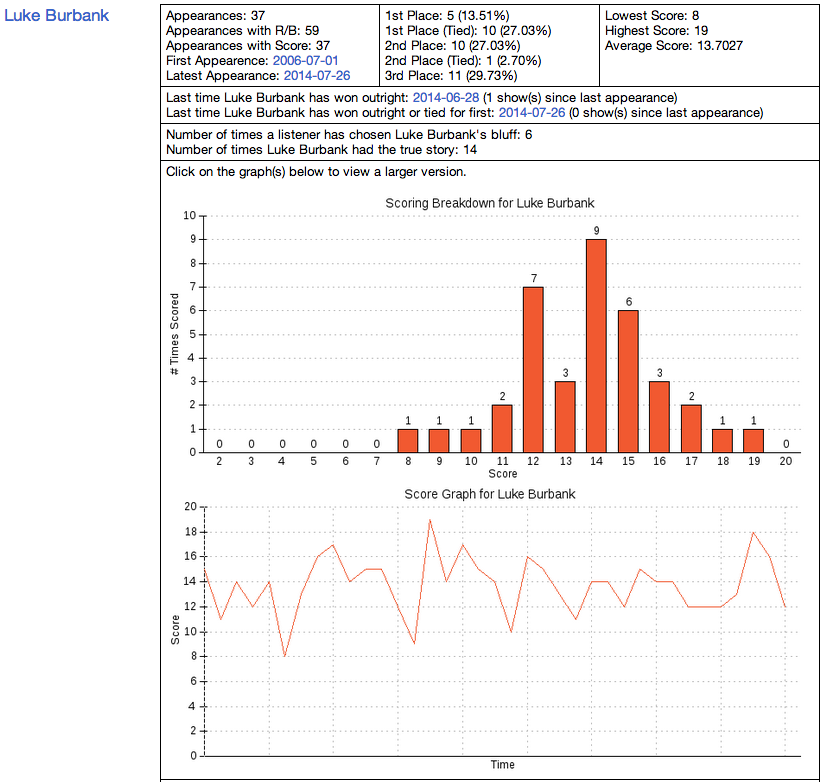
The other problem with the graph showing a panelist’s score over time is it becomes harder to read as more data points are added.
To solve all of the problem with the current graphs, I went back to the drawing board and started to research various charting and graphing libraries. In order to narrow down the field, I created a list of requirements that the libraries must meet:
- The ability to create any kind of bar, column, line or stacked graph from a single library
- Ease of customization of the graph’s style, labeling and manipulation of the axes
- Support for interactive graphs to allow zooming and panning of the graph
- Pull graph data from an external data source
- Mobile device friendly
A couple of weeks ago, I decided to use the AmCharts JavaScript Charts to programmatically create the graphs for the Stats Page. The library meets all five requirements laid out above and both a free and a paid version are available. The only gotcha that the free version had was it includes a small link in the corner of the rendered graph. I don’t really have a problem with that and may look at moving to the paid version at a later date (if/when funds are available).
After working out a way to pull the graph data that the library would need from the database, I started working on the code to generate the actual graphs. At first, I thought about having both graphs generated for each of the panelists on the main Panelists page; but, after incorporating the code to wire up and render the graphs, render time on the page was an unacceptable 15 seconds. The excessive render time was due to having to pull and parse the customized JavaScript and JSON data for each set of graphs.
At the end of the day, I opted to only include the panelist score breakdown and score trending graphs on the individual panelist page. Below is what the new graphs look like:
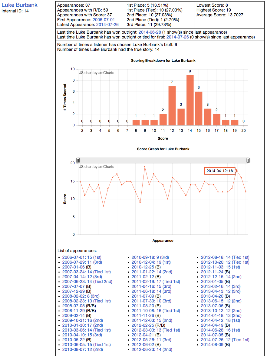
The new version of the panelist score breakdown graph is functionally identical to the previous version; though, the entire graph is now rendered by the browser. This means that the graph should be much easier on the eyes.
The biggest change is with the panelist score trending graph, in which you can now zoom into the graph and pan the graph back and forth. Also, you can hover your mouse (or finger) on the graph and see a text balloon showing both the show’s date and the score the panelist had for that show. To zoom in, just click and drag to select a region of the graph to zoom into. Once zoomed in, you can zoom back out by clicking on “Show All” that appears in the upper-right corner. Also when zoomed in, you can use the slider right above the graph area to pan through the data.
At this point, I have tested out the new graph on most modern browsers on Windows, Mac OS X and iOS devices. That said, if you are running Windows and use Internet Explorer, I would say that version 10 would be the minimum recommended version. Although Internet Explorer 9 does render the graphs, it seems to slower to render and has a few minor quirks when zooming and panning.